The internet is a bustling digital marketplace, where everyone is trying to attract as many visitors as possible to their online storefronts – their websites. One of the most critical factors in drawing an audience is responsive design, and it’s essential to grasp its importance.
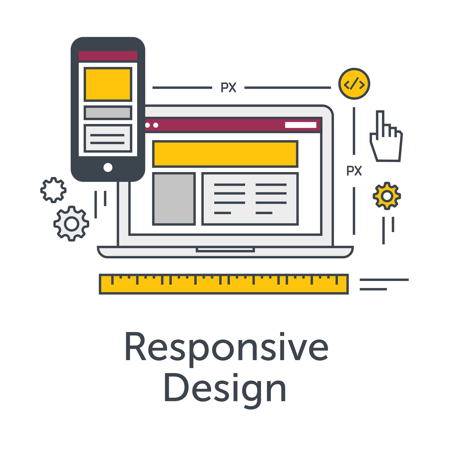
Definition and Importance of Responsive Design
Responsive design, in simple terms, is when your website’s design automatically adjusts to the device your visitors are using, be it a smartphone, tablet, or desktop computer. It’s crucial because:
– It ensures a seamless user experience, no matter the device.
– It enhances your site’s mobile-friendliness, a critical factor given the rise of mobile web browsing.
Responsive design isn’t just a nice-to-have anymore – it’s a must.
Explanation of the Impact of Website Traffic on Business Success
The more people that visit your website, the greater the potential for increased revenue, brand recognition, and customer engagement. Traffic can make or break your online presence. It doesn’t matter how great your product, service, or content is, if people aren’t coming to your site, they won’t know about it. In other words, website traffic is like oxygen to your online business – it keeps it alive and thriving.
Benefits of Responsive Design
As the digital landscape becomes increasingly mobile, it’s essential that businesses consider responsive design for their websites. Let’s dive into the numerous benefits this approach offers.
Improved User Experience
A significant benefit of responsive design is the superior user experience it affords. On a responsive website, users can effortlessly navigate and consume content, regardless of device or screen size. Here are a few key aspects where user experience is enhanced:
• Smooth navigation: Users can easily find what they’re looking for without resizing or panning.
• Quick loading times: Responsive design generally speeds up page load times, keeping visitors engaged and less likely to leave.
• Consistent look and feel: A unified design across all devices reinforces your brand identity and provides a consistent experience.
Increased Mobile Traffic
As smartphone usage continues to rise, having a mobile-friendly site is no longer optional, it’s a necessity. A responsive design adapts to any screen size, creating a user-friendly environment that draws more mobile users. A site optimized for mobile usage can significantly increase website traffic, potentially boosting your bottom line.
Enhanced SEO Performance
Lastly, responsive design can play a significant role in Search Engine Optimization (SEO). Google favors mobile-friendly websites and offers them higher ranks on their search results page. This means that a responsive website is more likely to appear in top search results, driving more organic traffic to your site. This is an excellent illustration of how responsive design can enhance your SEO performance.
Improved User Experience
Your website visitors want to have a seamless and enjoyable browsing experience. That’s where a responsive design comes into play.
Importance of Mobile-Friendly Websites
With the increasing use of smartphones and tablets for internet browsing, it’s crucial that your website is mobile-friendly. A hard-to-navigate webpage on a small screen is a surefire way to make your visitors leave. Statistics reveal that around 53% of mobile users abandon websites that take longer than 3 seconds to load! A responsive website:
– Loads quickly across various devices.
– Makes navigation and usage intuitive and effortless.
– Keeps content and visual elements consistent throughout.
Responsive Design and Its Impact on User Experience
Responsive design enhances the user experience by automatically optimizing your website’s layout according to the user’s device. Instead of constantly zooming in and out or sideways scrolling to view content, responsive design presents everything in a user-friendly manner. Your visitors appreciate this seamless navigation, leading to increased engagement rates, longer stays on your pages, and more importantly, higher conversion rates.
Case Studies Highlighting Positive User Feedback After Implementing Responsive Design
Several businesses have seen a leap in user satisfaction after implementing responsive design. For instance, Time Magazine revamped their site to a responsive design, which resulted in users staying 44% longer. Similarly, Walmart Canada saw mobile orders skyrocket by 98% after they had implemented a responsive design. These cases validate that investing in responsive design will significantly upturn your website traffic and user engagement.
Increased Mobile Traffic
With the surge in smartphone usage, it has become more crucial than ever for websites to be mobile-friendly. In a world where people frequently use their handheld devices to navigate the internet, compatibility with a range of screen sizes significantly impacts user experience.
Growing Importance of Mobile Devices in Website Traffic
The advent of technology has changed our browsing behavior. Mobile devices have emerged as a powerful tool significantly impacting how we consume content and interact online. Among the multiple reasons for this shift, the convenience and accessibility that smartphones offer top the list. These handy gadgets make internet browsing accessible at any time, from anywhere, making them a top choice for most people.
Statistics and Research Supporting the Need for Mobile-Friendly Websites
* As per Statista, over half of all internet traffic worldwide is generated via mobile phones, and this percentage continues to grow year over year.
* Google also reported in a 2018 study that 61% of mobile users are likely to leave a website if it doesn’t look good or function well on their mobile device.
These numbers underscore the critical importance of having a mobile-friendly website to attract and retain users.
How Responsive Design can Attract and Retain Mobile Users
Responsive design is a website design strategy that ensures your website is both visually appealing and functional on any screen size. It automatically aligns and resizes images, adjusts navigation menus, and modifies layout to provide a superior user experience, whether on a large desktop monitor or a small smartphone screen. In addition to providing a seamless user experience, responsive design ensures that your website content is delivered quickly and correctly, significantly reducing page load times thereby improving SEO rankings. It’s a crucial tool for not just driving but also retaining mobile traffic.
Enhanced SEO Performance
Understanding the role of SEO and its profound impact on website traffic is a key factor in digital marketing strategy. SEO, or Search Engine Optimization, is all about getting your website to rank higher in search engine results. This directly affects your website traffic because the higher you rank, the more visible your site becomes to users, thereby attracting more visitors. Think of SEO as the spotlight that brings your website center stage in the bustling arena of the internet.
How Responsive Design Contributes to SEO Success
Responsive design plays a significant role in optimizing your site for SEO. Google has openly stated that it uses mobile-friendliness as a ranking signal. Having a responsive design means that your website is capable of adapting to any screen size, offering a consistent user experience on all devices. This functionality tends to keep visitors on your site for longer periods, reducing bounce rates, and signaling positive user behavior to search engines. In essence, implementing responsive design not only pleases your users but also catches the favorable attention of search engines.
Examples of Websites Benefiting From Responsive Design in Terms of Search Engine Rankings
To demonstrate the effects of responsive design, let’s examine a few examples. Shopify, a leading commerce platform, redesigned its website to be mobile-friendly and saw a 50% increase in mobile sales. Airbnb, the globally renowned vacation rental marketplace, also transitioned to a responsive design. Their average listing now appears on the first page of search engine results, significantly growing site traffic. These companies are proof that responsiveness is no longer an option but a necessary tool for SEO success. The examples distinctly show how investing the right resources into responsive design can lead to better search engine rankings and a substantial increase in website traffic.
Best Practices for Responsive Design
Responsive design has changed the game in web development, allowing us to make websites more attractive and user-friendly. But like any good thing, it comes with its challenges and requires careful execution to maximize its benefits.
Step-by-Step Process for Implementing Responsive Design
First things first – plan your layout. Beyond planning for desktop, you need to consider how elements will scale and rearrange on smaller screens. This includes deciding priority for more critical elements like navigation and CTAs.
– Sketch different screen layouts
– Use a flexible grid-based layout
– Prioritize content visibility for different screen sizes
Next, ensure all images and multimedia are flexible. Use CSS to control image widths and ensure they scale with the layout.
Thirdly, always test your designs on different devices. Tools like Google’s Mobile-Friendly Test can help identify problems that aren’t evident on your machine.
Tips for Optimizing Responsive Design for Various Screen Sizes
– Don’t hide content on mobile; rearrange it.
– Use media queries to manipulate layout elements for various screen sizes.
– Incorporate touch controls for smaller screens.
Common Responsive Design Mistakes to Avoid
Everyone makes mistakes, but in responsive design, some mistakes are more common than others. Here are a few things to avoid:
– Designing for a specific device
– Not taking touch screens into consideration
– Ignoring load times
– Using non-responsive plugins
Maybe some of these points are not new for you. But remember, even experienced developers occasionally overlook them. So it’s always good to review and keep tabs on the best practices!
Case Studies
Let’s delve into some real-life examples where responsive design played a crucial role in enhancing website traffic.
Success Stories of Businesses that Improved Traffic through Responsive Design
Take, for instance, the case of an online apparel store. Previously, they had a standard web design that looked good on desktop but was cumbersome on mobile devices. They switched to a responsive design, and within a few months, reported a significant growth in traffic. In fact, nearly half of the increment came from mobile users. This revealed how mobile-friendly design helps in reaching a wider audience.
In yet another scenario, a financial consultancy firm tweaked their website design to a responsive one, aiming to improve the user experience. Much to their delight, they saw an impressive surge in their website visits. This clearly highlighted that responsive design not just helps in enhancing the look and feel of the website but also in driving traffic.
Analyzing the Impact of Responsive Design on Key Metrics (e.g., Bounce Rate, Time on Site, Conversion Rate)
When we deep dive into the metrics, the benefits of responsive design become even more apparent.
– Bounce rate: With a responsive website, users can find what they’re looking for faster and easier which significantly reduces the bounce rate.
– Time on site: As the user experience improves, people stay longer leading to increased time on site.
– Conversion rate: A user-friendly site leads to better user engagement, resulting in higher conversion rates.
These compelling cases emphasize the powerful role of responsive design in driving website traffic.
Conclusion
Recap of the Importance of Responsive Design in Driving Website Traffic
In every aspect of our online dealings, responsive design proves to be a must-have for any website looking to thrive. A mobile-friendly design not only enhances the user experience but significantly boosts website traffic. SEO and the use of royalty-free images go hand-in-hand with responsive design, working together to improve search engine rankings and visibility. Now more than ever, prioritizing responsive design is integral to the success of your online presence.
Call-to-Action for Implementing Responsive Design on Websites to Increase Traffic
Do not let your website fall by the wayside. Be proactive and make the move to bring your site into the modern age with a responsive design. Don’t forget – the benefits are innumerable, from a more satisfied audience to a bump in your search engine rankings.
– Embrace a mobile-friendly design
– Enhance your user experience
– Leverage SEO for improved rankings
– Utilize royalty-free images for visual appeal It’s time to take your website to new heights with responsive design. The traffic will follow! Remember, a well-designed, responsive site is now not just an option, but a necessity.